
Thursday, 29 March 2012


Wednesday, 21 March 2012
Design Characteristics
| This is a Love Calender so I put a picture of love in to make the teens understand more about it and have more strategies.( In the letters I wrote below the picture it is when we hate him so much not he. Thanks ) I also change the color so it fit with the purpose. |  |
| This is a Postcard about Happy Anniversary but I change it into Happy Break Up Anniversary so teens feel it is funny. I put a stupid quote so it would be funny. I put picture so the audience could visualize it. | 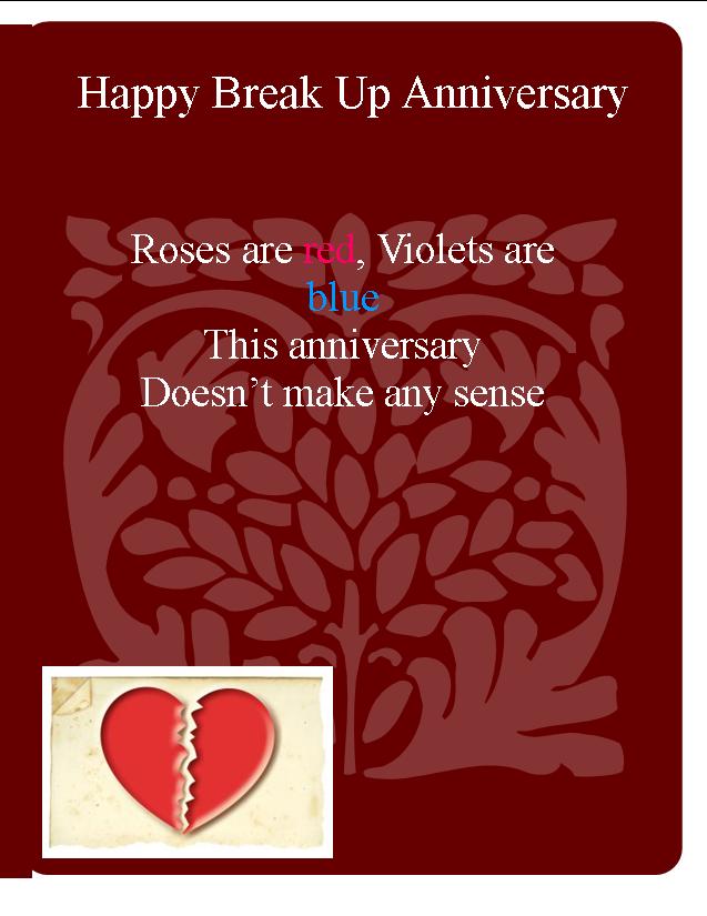 |
Monday, 19 March 2012
Bad and Good Logo!!!!
What make it a good Logo?
|  |
Why is this a bad logo?
|  |
5 Rules for a good logo
- The color fit
- The logo show what the company was about
- The creativity in the words
- Simple features like text style, font size, color, tone, contrast and simple graphic
- Keep the audience interesting in yours logo even adult or children
Thursday, 15 March 2012
Rule for Presenting
Recommended for the bad presentation.
- More images
- Less words
- Keep the font, layout, size, and bullet point consistent
- Make sure who is it for.
- Keep consistent
- Put images
- Keep it simple
- Make sure who is the audience
- Good ideas
- Good creativity
Using Paint.net

2. I use select then move select to make it from a normal car to a toy car.
 3. I add the word My Supercar.
1. I go to Layer and found Duplicate Layer which make into 2 layer now.
2. Now I go to Adjustments and find Black and White.
3. Now I Use the eraser and erase the liberty part.
Wednesday, 7 March 2012
Multimedia Science Project
In this video, are some of the things I change for the video:
| |
 | Here are "Things" that I contain in one of my slides. Read the comment to understand "Things" |
Thursday, 1 March 2012
Subscribe to:
Comments (Atom)